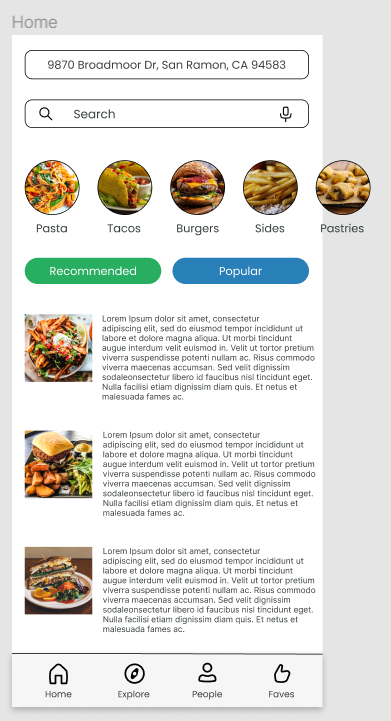
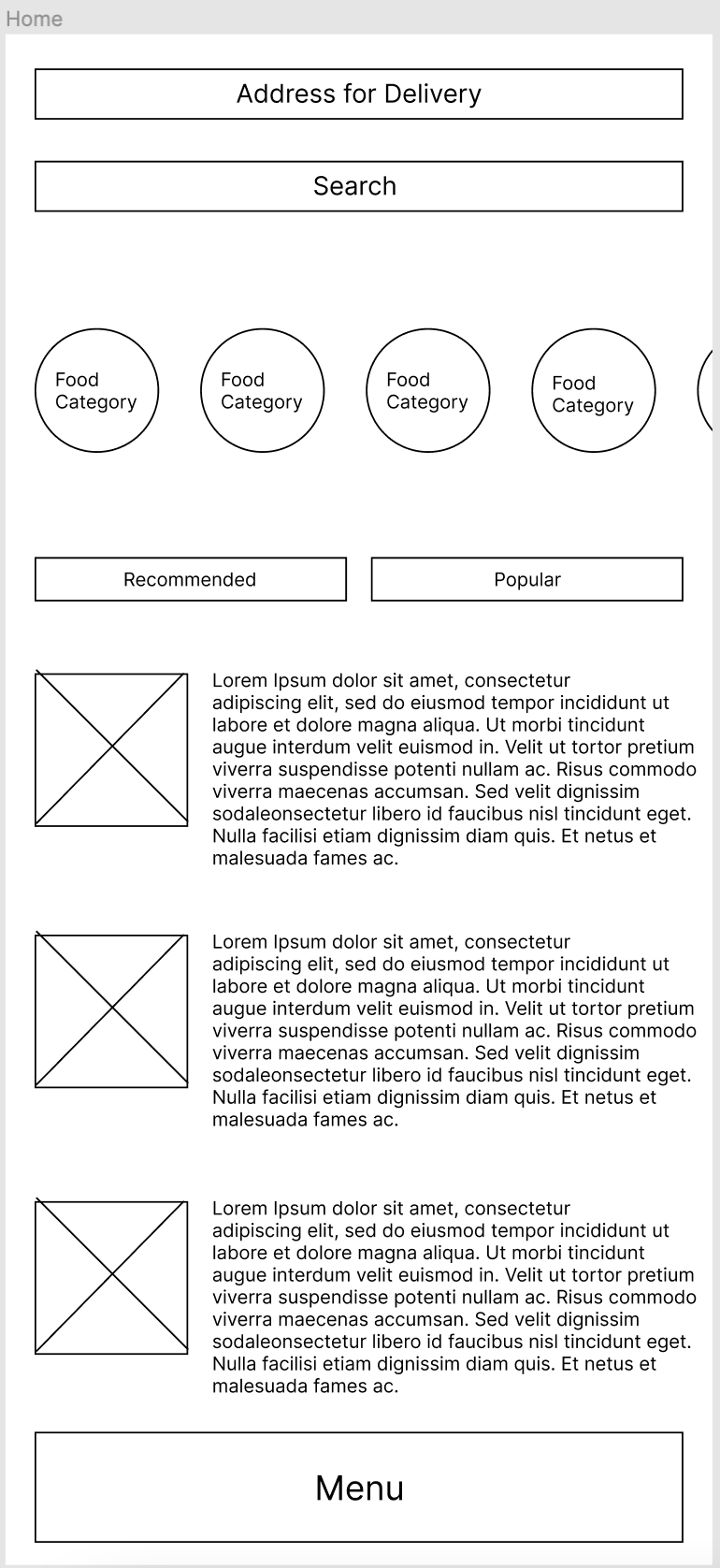
 1. Designing is very simple and easy, made easier by styles which keeps redundancy low.
2. Putting in images. 3. Getting Auto-layouts to work. 4. I didn't use any of the menus from the kit because I didn't like any of them, but instead, I made my own menu which I think is very simple and intuitive.
0 Comments
Part 1:
1. The video gives a new perspective on the problems faced by people that aren't thought of when designing things. 2. Have accessible bathrooms also have lower toilets, make clothing for smaller people so that they aren't required to make alterations or look in the child section. 3. Empathy Part 2: 1. Computer Science, Cognitive Science, Graphic Designers 2. Don Norman 3. Engineering and Mathematical Psychology 4. The Design of Everyday Things 5. Ability to discover the reason the object exists and what it can and will be able to do for us, and to understand it, be able to figure out how the thing works. 6. Cues that help people decode what an object does without instructions. 7. Sensory cues that communicate the meaning of the object to the user. 8. The Seven Stages 9. A "dumbing down" of user behavior. 10. Steve Jobs Part 3: 1. Google Maps, the second the app loads in, it's very simple you have a map, and an input to put your destination. Accordances and Signifiers are present in the app. 2. Google Classroom. GC has a very simple UI, and the UX is also very functional. Very easy to switch between classes and view all material. 1. What is one thing that you learned from Chip Kidd?
Use useful mystery to entice viewers, and useful clarity to make your design clear and not confusing. 2. Would you like to do the same type of design as Chip, why or why not? Yeah, books are fun to read, and designing book covers would require reading a lot of books, so it would be fun and interesting as well. 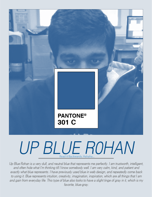 1. I learnt how to gray scale an image and to get a Pantone Color Swatch in Illustrator.
2. I am not surprised that this is my signature color because I have connected with this color for such a long time, and this is just a slightly darker shade than I was initially thinking. 3. A good complimentary color would be Pantone 1485 C goes very well with this blue, light-orange. 4. Two good analogous color would be Pantone 517 C and Pantone 3242 C, these are a light purple and a sea green, respectively. 1. It was easy to decipher the color. There were a lot of shades in the palettes, and the candies are probably based on one of these colors, so it becomes easier.
2. It improves the consistency of colors used across a brand or company. If there were constant differences it would cause problems for branding. 3. When we're creating multiple different instances of the same color, and we need to use the same color. We could also use it when printing, to preserve the exact color we need. |
Rohan R.Computer Enthusiast, loves coding and designing websites with HTML and CSS. Archives
May 2022
Categories |
 RSS Feed
