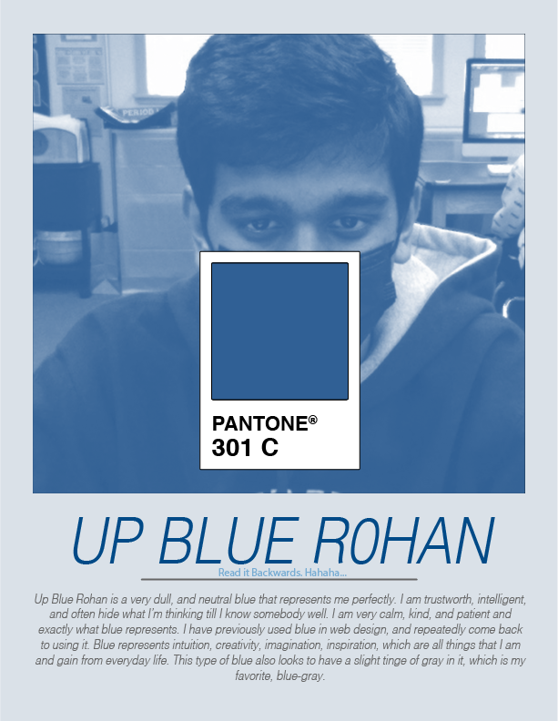
 1. I learnt how to gray scale an image and to get a Pantone Color Swatch in Illustrator.
2. I am not surprised that this is my signature color because I have connected with this color for such a long time, and this is just a slightly darker shade than I was initially thinking. 3. A good complimentary color would be Pantone 1485 C goes very well with this blue, light-orange. 4. Two good analogous color would be Pantone 517 C and Pantone 3242 C, these are a light purple and a sea green, respectively.
0 Comments
Leave a Reply. |
Rohan R.Computer Enthusiast, loves coding and designing websites with HTML and CSS. Archives
May 2022
Categories |
 RSS Feed
