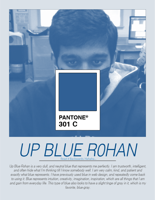
 1. I learnt how to gray scale an image and to get a Pantone Color Swatch in Illustrator.
2. I am not surprised that this is my signature color because I have connected with this color for such a long time, and this is just a slightly darker shade than I was initially thinking. 3. A good complimentary color would be Pantone 1485 C goes very well with this blue, light-orange. 4. Two good analogous color would be Pantone 517 C and Pantone 3242 C, these are a light purple and a sea green, respectively.
0 Comments
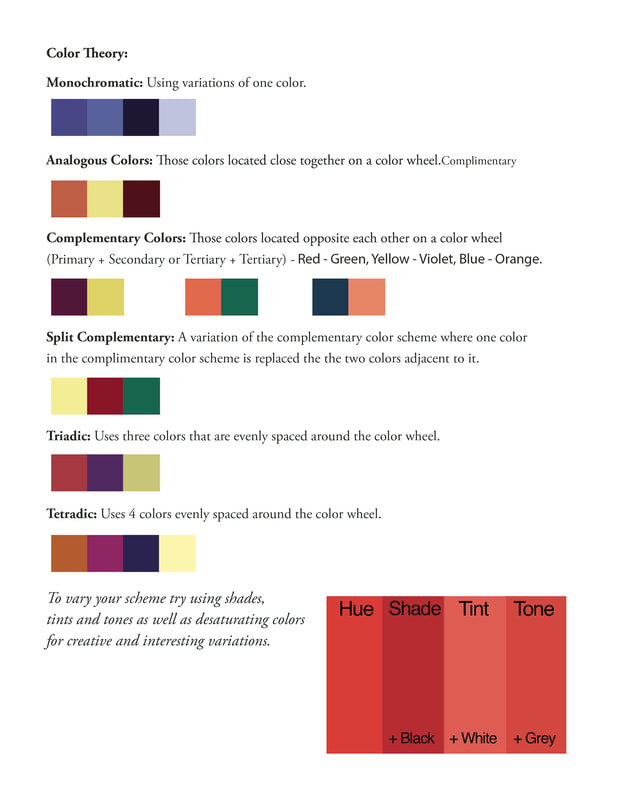
1. It was easy to decipher the color. There were a lot of shades in the palettes, and the candies are probably based on one of these colors, so it becomes easier.
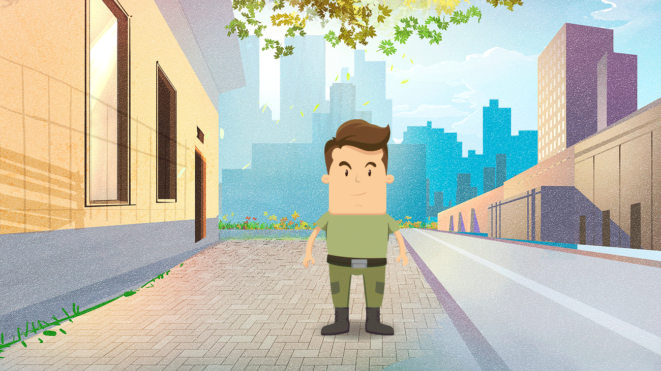
2. It improves the consistency of colors used across a brand or company. If there were constant differences it would cause problems for branding. 3. When we're creating multiple different instances of the same color, and we need to use the same color. We could also use it when printing, to preserve the exact color we need.  1. I am using Staging, and slow-in
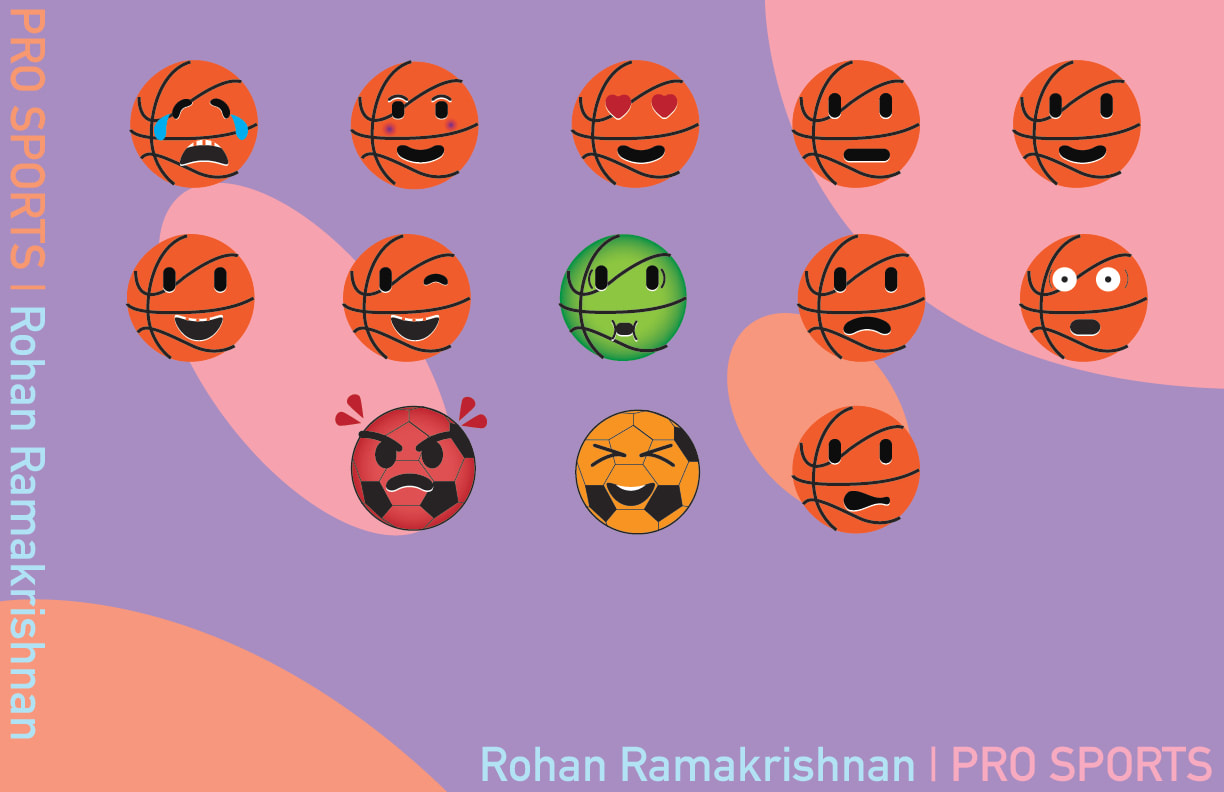
2. It was pretty easy, I had some problems with some distortion, but figured it out. 3. The gradient in the background looked really good at the end. 4. I would add something to the top of my artboard because, it looks empty. |
Rohan R.Computer Enthusiast, loves coding and designing websites with HTML and CSS. Archives
May 2022
Categories |
 RSS Feed
